Website Redesign
A human-centered approach to serving three distinct audiences.
Setting the stage
Setting the stage
The Standard Insurance Company needed a website redesign that would seamlessly serve three very different audiences—employers, employees, and brokers—each with unique goals and needs. However, there was a catch:
I was tasked with crafting a strategy and design that would deliver a human-centered experience without the usual groundwork of user interviews or analytics.
No discovery user research.
A tight timeline and budget that left little room for iteration.
Phase 1: Discovery & Strategy
Phase 1: Discovery & Strategy
What I did
1. Stakeholder Workshops & Interviews
Uncovered internal goals and audience assumptions.
2. Competitive Analysis
Mapped out industry trends and competitor approaches.
Identified best practices for organizing content by audience.
3. Journey Mapping
Created assumptive journey maps for key tasks (log-in, navigation, finding support).
Discovery
Product Goals
Demonstrate commitment to accessibility
Create a human-centered experience
Drive consistency at every stage of the user journey
Modernize the technology
Self-service tools
Stakeholders were aligned on prioritizing accessibility and self-service tools, which shaped the site's goals.
Competitor Research
Discovery
To compensate for the lack of user interviews, I conducted a competitive analysis to understand how similar companies structured their sites for diverse audiences
Key actions
Built a competitor matrix in Miro to evaluate navigation, content organization, and user tools.
Focused on audience segmentation strategies, self-service tools, and accessibility features.
What I Learned
Competitor sites segmented content by audience, inspiring the foundation for our information architecture.
Intuitive navigation and clear labeling were critical for seamless user experiences.
Image of Competitor/Comparator Matrix
Discovery
Journey Maps
I developed three critical user journey maps—log-in & support, navigation, and brand story—deemed essential for the website, serving as guiding references for our wireframe design decisions in the subsequent stages.
Discovery
Findings & Recommendations
After concluding the discovery phase, our team presented discovery findings and recommendations to the clients. Key takeaways from the presentation encompassed user preferences, proposed site improvements, and notable competitor features.
Slide from presentation deck explaining the top tasks aligned with the different users.
Phase 2: Building Trust with Stakeholders
Phase 2: Building Trust with Stakeholders
Deep Dive Research & Analysis
Information Architecture
Utilizing competitor research and an analysis of the current site, I formulated an initial information architecture draft. It was determined that site content would be categorized according to audience type—employees, employers, and brokers.
I conducted an analysis of the current site's content organization and identified potential improvement opportunities using a Miro board to track my notes.
I documented competitor navigational menus in Miro to serve as inspiration for the new site's information architecture, aiding in organizing the site structure and formulating various labels.
High-Level Information Architecture
Information Architecture
I presented the high-level information architecture to the clients, outlining how I intended to organize the site based on audience type, before proceeding to the detailed site map.
During the information architecture review, stakeholders became uneasy. They asked:
“What do the users think?”
This moment was pivotal. It exposed the risk of proceeding without user validation.
How I handled it:
I scheduled extra touchpoints to give stakeholders greater visibility.
I proposed a tree test as a cost-effective way to validate assumptions with users.
Information Architecture
Tree Tests
After drafting the detailed information architecture, I conducted tree tests with participants recruited from userinterviews.com.
This is an image of the Miro board where I synthesized the data from the Tree Tests.
Outcome
Stakeholders regained confidence after seeing the IA validated through the tree test.
Phase 3: Designing with Confidence
Phase 3: Designing with Confidence
Wireframing & Prototyping
Design
The design phase commenced with the wireframing process, beginning with low-fidelity sketches that were then translated into mid-fidelity Figma pages. These pages underwent client feedback and edits prior to progression into the prototyping and testing stages.
Goals
Design wireframes for key pages demonstrating audience segmentation on the site.
Create intuitive navigational menus for desktop and mobile platforms.
Design self-service tools to alleviate user confusion and reduce service burden on the business.
Develop pages intended for inclusion in the clickable prototype used for usability testing.
I start by sketching low-fidelity wireframes as the foundation for the site design.
I created Figma wireframes for client presentations and a clickable prototype for usability testing.
Desktop and mobile navigation menus with primary and child pages were designed to provide quick access to internal pages, based on the assumption that users seek specific information efficiently.
Key self-service tools, like Find a Form and File a Claim, were prioritized to address shortcomings and reduce service issues for users and the business.
The contact page wireframe was prioritized based on stakeholder feedback about difficulties finding service information.
The homepage was crucial for directing each audience segment to their portal page.
Design
Usability Testing
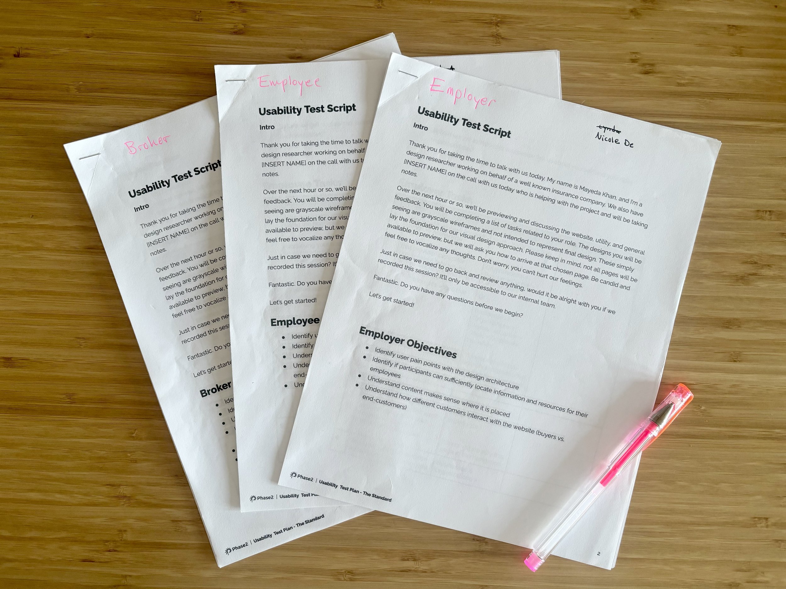
Pictured: three separate discussion guides for the tests & a section of the FigJam board where I synthesized my notes through affinity diagramming.
This was the first opportunity to engage real users. I conducted 15 usability tests with employees, employers, and brokers.
Key Insights
Users quickly located their audience-specific sections.
Stakeholders were thrilled to see users navigate seamlessly and complete tasks with ease.
Unexpected Discovery
Users often explored sections for other audiences to better understand perspectives beyond their own.
Usability Testing
Findings & Recommendations
Key Findings
Users easily located audience-specific sections via primary navigation and Home page links.
Audience segments often explored other sections to gain different perspectives.
Navigation and self-service tools performed well but revealed areas for refinement.
Recommendations
Optimize labels for clarity across audience segments.
Enhance the self-service tools for greater efficiency.
Incorporate user feedback into final design iterations.
Slide from the Findings report detailing user insights about the home page.
Slide from the Recommendations report detailing design edits to improve the user experience.
Conclusion
Successes & Opportunities
This project highlighted the importance of involving real users, especially when designing for diverse audiences. Despite its challenges, it was a rewarding experience that combined strategic thinking with iterative design.
Successes
Validated Design Strategy: Usability testing confirmed the audience-segmented structure was effective and intuitive.
Stakeholder Collaboration: Building trust through frequent check-ins ensured alignment and confidence in the process.
Impactful Research: Competitive analysis provided a strong foundation, guiding early decisions before user validation.
Opportunities
Earlier User Research: Starting with user interviews would have built confidence and shaped strategy from the outset.
Pre-Testing the Existing Site: Understanding current pain points would have clarified what to improve.
Leveraging Analytics: Access to site performance data could have highlighted high-value areas to prioritize in the redesign.


